Building My New Website Using Adobe Dreamweaver
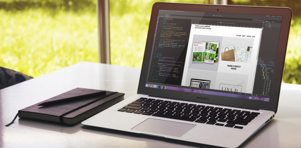
There’s a lot of things that comes with even deciding on where to start with your own website. Being in charge of everything is so, refreshing. Deciding which color or which typeface fits you best, and so on. This is why I love web design. Reading all of these different colored symbols and random letters on a screen that somehow create a beautiful thing can be awfully tedious though. Let me just drop a screenshot of what I have been staring at for the past few months. P.S there are affiliate links in this post, to learn more about them click here.
An Inside Look
This is one of the many projects that I’ve been keeping “hush” about, and I’m so so so so excited to FINALLY be able to share with you. If you take a look the left side of the screen is the HTML, and on the right is the live preview of what it should look like. And by should I mean, definitely open it in your browser before relying on Adobe Dreamweaver‘s “live” preview. Trust me.
Related Post: One Way to Build Your Portfolio Quickly
The Idea
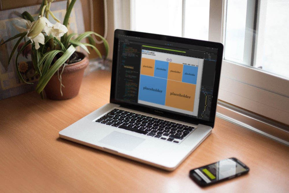
I was stuck on about two design ideas for this project of mine. I chose to keep the navigation bar on the top, with a consistent header that followed you down the page as you scrolled. This allowed the images/content of the site to be wider, which I’m a big fan of. Below is an image of what my program looked like with my “place holder” images, very fabulous am I right?
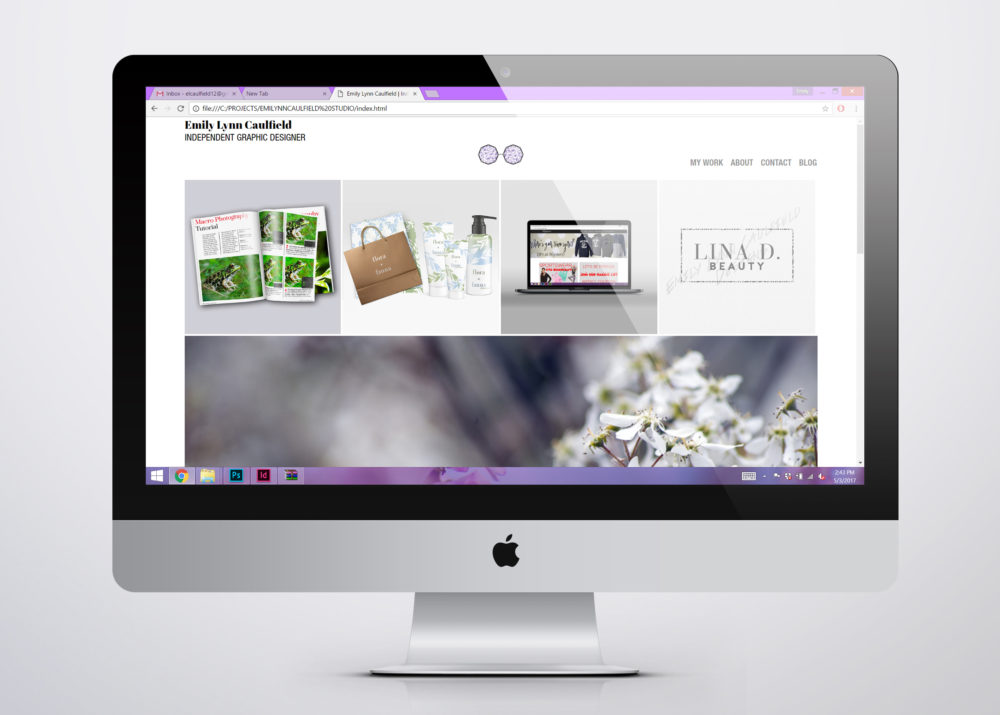
I decided to go with the 5 things that made me happiest when designing or creating. Those 5 are Editorial Design, Web Design, Brand Identity, Logos/Illustration Design, & Photography. Photography is one of the main reasons that got me into art, but most importantly it had introduced me to Adobe Photoshop. For those of you that didn’t know already, Adobe Photoshop and I go way back.
The Process
One day after a ridiculous amount of sketching and researching and thought processing… I opened up Adobe Dreamweaver and <p>coded my little heart out</p> … No one? Sorry but I definitely laughed while typing that. Anyway, I started with the bulk of it, getting all of my “divs” (a.k.a. boxes) in order. Once my rough draft of a layout was in order, I moved on to fixing the little spacing errors and when everything looked structurally solid, I moved on to “making it look pretty,” otherwise known as the Cascading Style Sheets. CSS is what gives your site flavor, or in my case a lot of purple.
P.S. Side note- the HTML color is defined as “thistle” and that’s what I’ve been using.
Related Post: Creating and Printing My Own Business Cards
and finally…
Images were edited, content created, and projects were all coordinated. It was a miracle, everything was finally in place. Well, almost everything. When you have complete control over your own website, you find yourself making little changes here and there as the days go on. I feel like this site will always be a work in progress, only because I’m always growing and learning new things. At least my brand will stay consistent throughout my site and so on, other things are open for change.
After days and days of working my butt off, the finished product is always my favorite part of a project. Although, it’s not completely finished- it has come a long way and I’m really excited for what the future holds for me and my brand. You can view my site for yourself by clicking here.
Related Post: MUST Haves for Designing
If you have any questions please feel free to comment below & of course my email is always open, and thank you for stopping by. ♥


Leave a Reply
An entrepreneur passionate about empowering women-owned small businesses by offering the resources they need to grow their online presence.
Hiya!
I'm Emily
BLOG
on the
HOW TO GET CLIENTS FROM YOUR SOCIAL MEDIA MARKETING →
THE INSTAGRAM HACK NO ONE IS TALKING ABOUT →
SWIPE THIS INSTAGRAM PINNED POSTS STRATEGY →
GROW YOUR SMALL BUSINESS USING THESE RESOURCES →
CAN YOU ADD LINKS TO PINTEREST IDEA PINS? →
HOW TO MAINTAIN BRAND CONSISTENCY AS A CREATIVE →
ALL BLOG POSTS


Wow. I give you major props for coding and designing your portfolio. I don’t have the time, energy, or patience. Looking forward to more.
Thank you so much! At some points it is a bit tedious but I could never just give up. Thanks for stopping by! ♥
Your site looks great and I love the Thistle color.
Thank you so much! It’s my favorite! 🙂
Love your design. I don’t know much about coding, that’s a nice skill to know!
Thank you! It’s an interesting topic to learn, but definitely one I enjoy. 🙂 Thanks for stopping by!
Your portfolio looks beautiful. Great job! I admire you for tackling coding. I’ve dabbled a bit too (self taught), and it’s quite rewarding when everything comes together with my own coding skills. Love it! Keep on being fabulous.
Thank you so much! At first I was self taught as well, now I have a bit of knowledge from school too. It’s funny how much you’re capable of learning on your own nowadays, I honestly prefer it! I 100% agree with you- it’s so refreshing to be done with a design after working so hard on it. Thanks for stopping by! ♥
I know the process is tedious but outcome is amazing. I do it myself and know how many hours I need to put into this. Love your site. Elegant.
You’re not wrong! Definitely takes time, and a bunch of effort. Thank you so much! I really appreciate it 🙂
This is amazing advice! This looks like a lot of work but definitely worth it in the end.
Much love,
Ashley | dearash.com
Totally worth it in the end, thanks for stopping by ♥
This is such a cool post! I love being able to see the behind the scenes of something like this. It’s amazing that a bunch of text can make something as pretty as that!
-Stephanie | http://www.nudelipdiaries.com
Thanks! When I first started learning HTML, I wondered the same thing! It’s crazy, haha ♥ Thanks for stopping by!
Amazing! I want to learn how to code and your outcome is great. Everything looks great.
Thank you so much! If you ever have any questions let me know- I would love to help 🙂 Thanks for stopping by!
I have been wanting to do the same for a while now, but it’s never late I guess 😀
your’s looks great !
There’s always time to start! Thank you so much! 🙂 let me know if you do, I’d love to see!
This is great, good job! I need to teach myself some new tricks like coding, SEO, etc. I like the layout of your site!
Thanks so much! It honestly comes in handy! And SEO too, definitely recommend teaching yourself a few things about SEO. Let me know if you do & if you have any questions about it- we can learn together! 🙂
Wow! I would never be able to do what you did! So awesome! Coding looks so tough!
Aw thanks! I’m sure if you wanted to you could! Anything’s possible 🙂
Congratulations on your site!!! I really think it’s super pretty, loved the colors and the details as your signature. Very girly and professional! 😀
xoxo, Pilar
http://thelifestylehunter.com
Thanks so much!! I really appreciate your lovely comments ♥
Awesome tips! Your post is informative and well detailed.
Thank you! 🙂
This is great information, I am always looking for the most up to date tips on building websites!
Thank you so much! Let me know if you have any questions! 🙂
It turned out AMAZING and that’s something you can be super proud of 🙂
xx Carly | http://www.thecarlycollective.com
Thank you so much you’re so sweet!! I really appreciate it 🙂
Thanks for the blog.
Thanks alot for the post.