


Basement Brew – Label Design
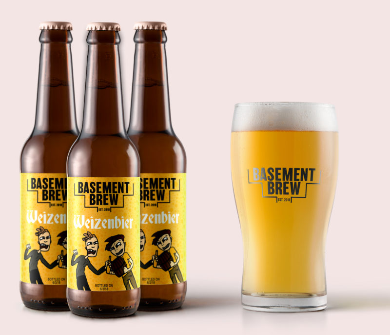
A beer bottle label design was definitely a first for me, but when told to “do whatever,” well… I did just that. So the first thing I did (of course) was create an illustrated version of the creators behind Basement Brew.
It was a very messy illustration when I first created it. Mostly because I had fun with it, instead of picking everything about it apart and worrying about making mistakes, I kind of just let it happen… I liked the way the lines had looked when drawing it out in Photoshop, but then I imported the illustration into Illustrator & made it a vector piece for a more “polished” look. I’m definitely happy with the outcome.
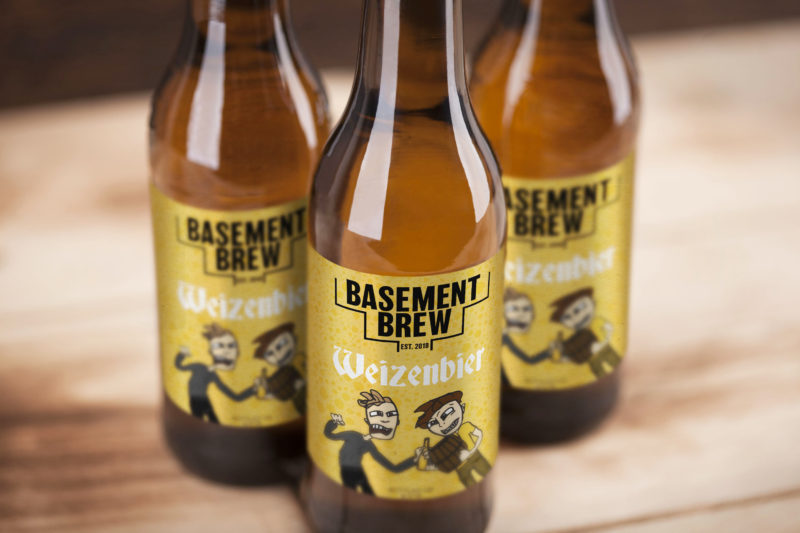
The not-so perfect lines made the cartoon look hand-drawn, giving it that home-made effect (like the beer). The logo is mostly type based with a tiny bit of line work. Being that these two are literally brewing beer in their basement, (the first batch was amazing by the way) I wanted to subtly add stairs to the business name “Basement Brew.” The logo is in black, because each different batch they make will have a different color label.
I had a lot of fun creating these labels, and look forward to creating more for these two! You can follow Basement Brew’s progress over on their Instagram!

Leave a Reply

An entrepreneur passionate about empowering women-owned small businesses by offering the resources they need to grow their online presence.
Hiya!
I'm Emily


BLOG
on the


HOW TO GET CLIENTS FROM YOUR SOCIAL MEDIA MARKETING →
THE INSTAGRAM HACK NO ONE IS TALKING ABOUT →
SWIPE THIS INSTAGRAM PINNED POSTS STRATEGY →
GROW YOUR SMALL BUSINESS USING THESE RESOURCES →

CAN YOU ADD LINKS TO PINTEREST IDEA PINS? →
HOW TO MAINTAIN BRAND CONSISTENCY AS A CREATIVE →
ALL BLOG POSTS


This is a really cool thing — I never knew that this was something that one could do. But also, of course it is something that is done. And you did a great job!
Thanks for sharing! x
Michelle
dressingwithstyle-s.com
Aw thank you so much!
Great design!
Thank you!! 🙂
I love this! So cool and different. Keep up the good work!
I think it’s a cool design
OMG! This is super cute and unique! Congrats on your first beer bottle design and I hope there are many more to come. If I ever come across this beer bottle, I will most definitely grab a pak and have a drink in your honor 🙂
XO Andie
http://andiesparkles.com
Thank you!! You’re so funny, I hope you find it one day too! 🙂